Bold flavor. Clear communication.
A great product was being held back by its packaging.
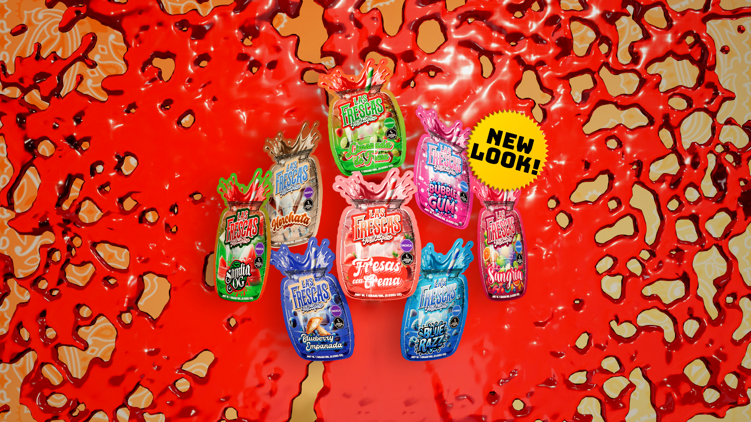
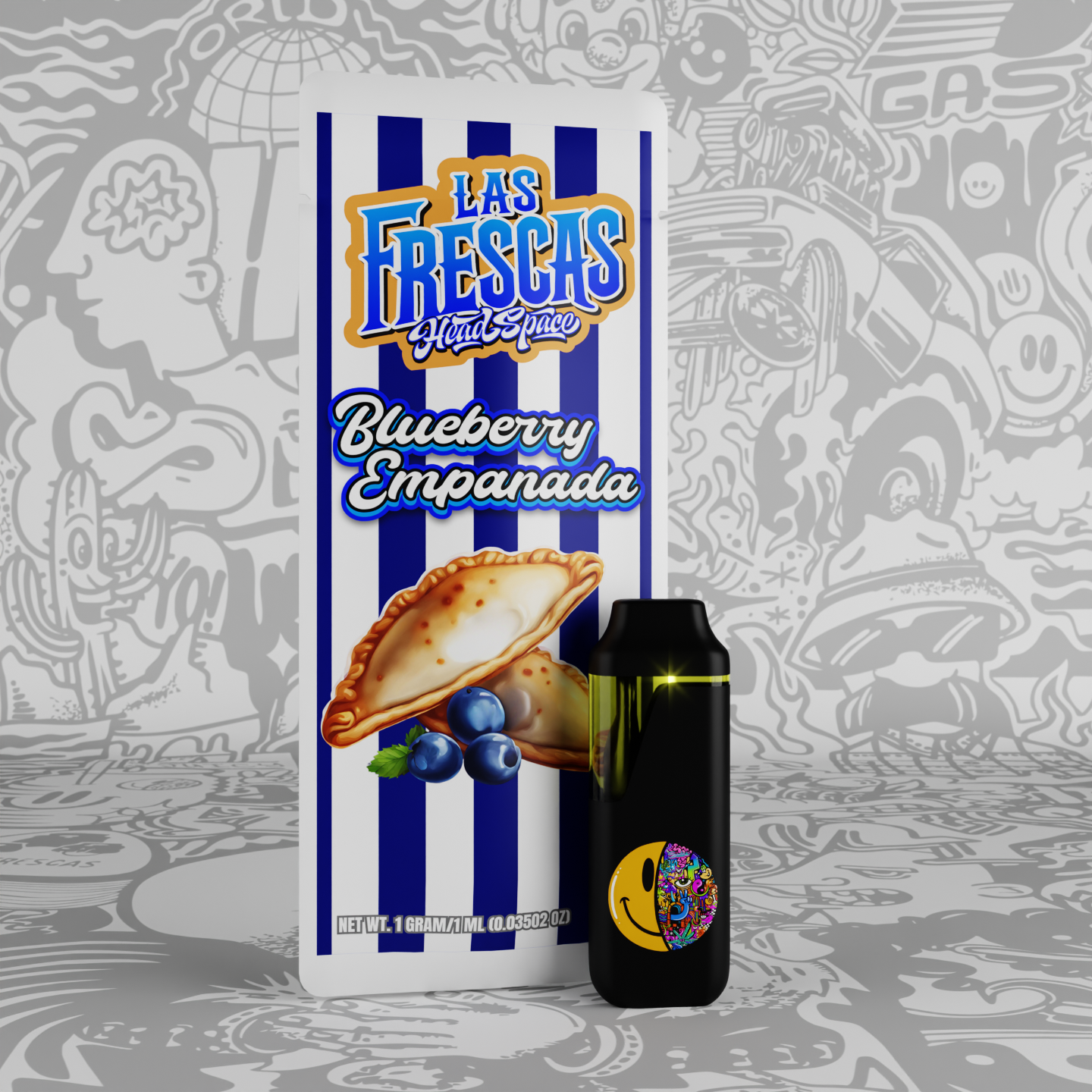
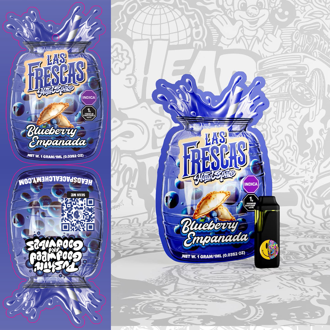
Las Frescas was moving fast — new SKUs, growing retail presence, real demand. But the packaging wasn't built for scale. Flavors were hard to tell apart, the visual system lacked cohesion, and the overall look didn't match the quality of what was inside. For a product competing on shelf in a crowded cannabis market, that gap was costing them. We rebuilt the entire line from scratch — developing a structured visual system rooted in Latin street-drink culture, with strong flavor differentiation, clear hierarchy, and production engineering built to handle growth. Every SKU needed to work individually and as a family.
The packaging launched. The numbers moved.
We handled the full production pipeline — custom die-lines, color calibration, white-ink layers, 3D renders, and vendor alignment. The new system was built to scale: adding SKUs wouldn't require reinventing the wheel. When the redesigned line hit in June 2025, monthly sales nearly doubled — from around 5,700 units to over 10,200 in a single month. That new baseline held. The floor rose and didn't come back down. That's what happens when packaging finally matches the product inside it.
Visit Project