
Headspace Alchemy was ready to relaunch its “Las Frescas” disposable vape line — but the brand’s previous packaging lacked cohesion and stopping power. The challenge was to build a strong visual identity across flavors, something that would stand out in a saturated market while feeling premium, playful, and deeply rooted in cultural familiarity.
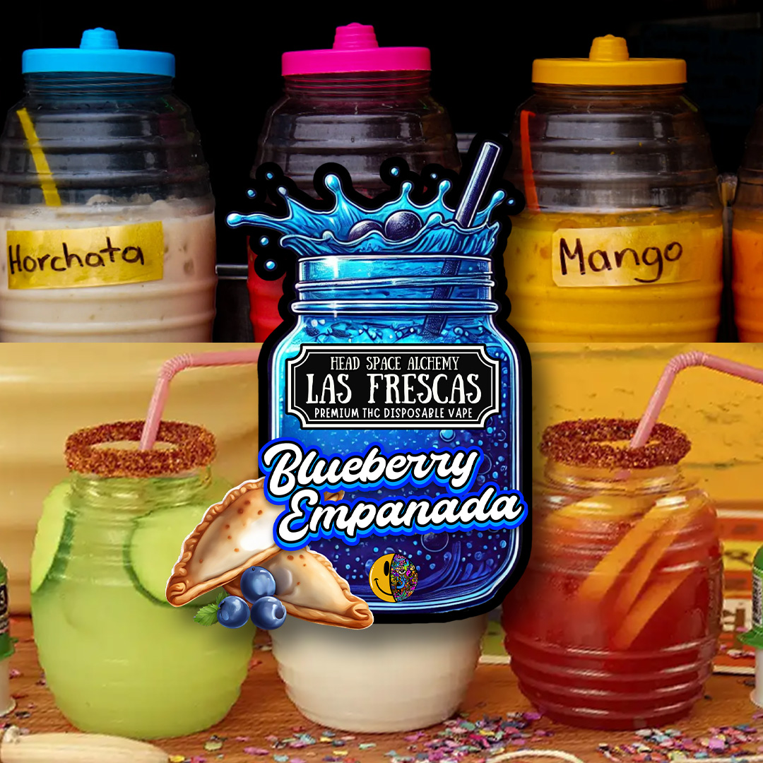
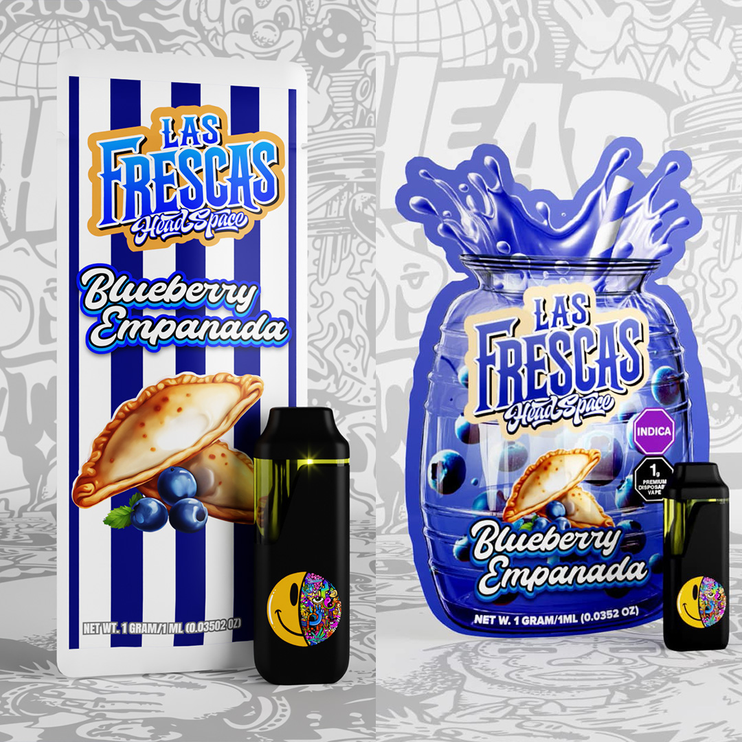
With “Las Frescas” directly inspired by aguas frescas, we saw an opportunity to create a design system that echoed the colorful energy of Latin street drinks — bold, fruity, icy, and vibrant. By centering the design on vitroleros (those oversized, rounded jugs often seen at taquerias and fruterías), we could craft packaging that felt both nostalgic and fresh, loud yet refined.
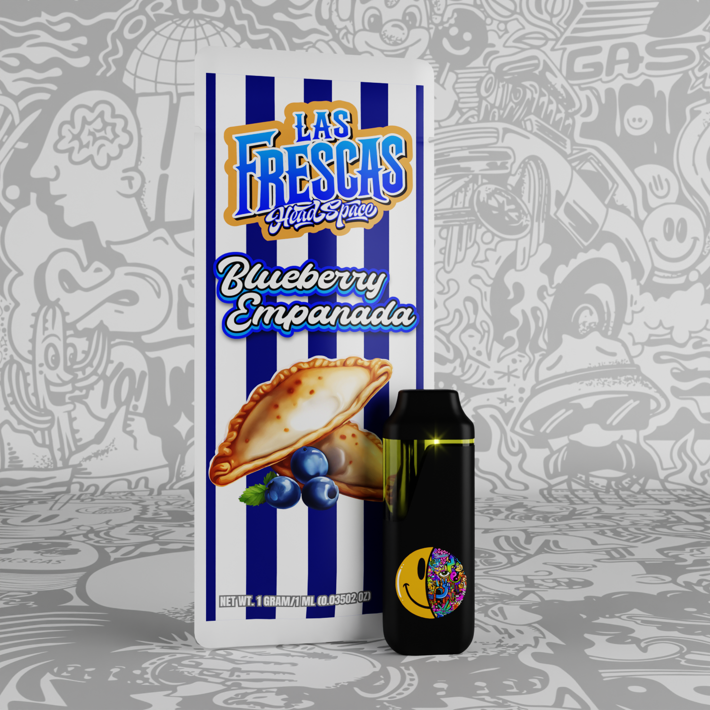
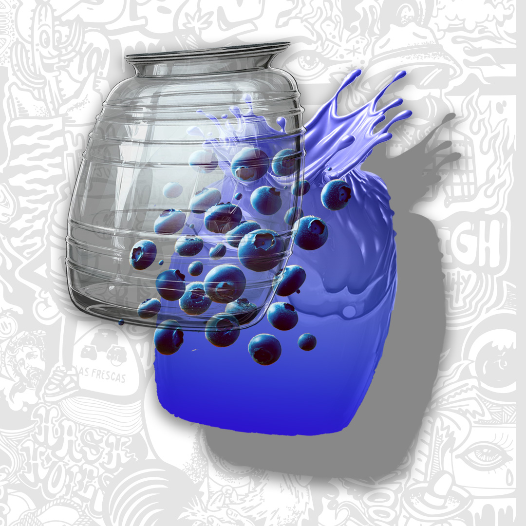
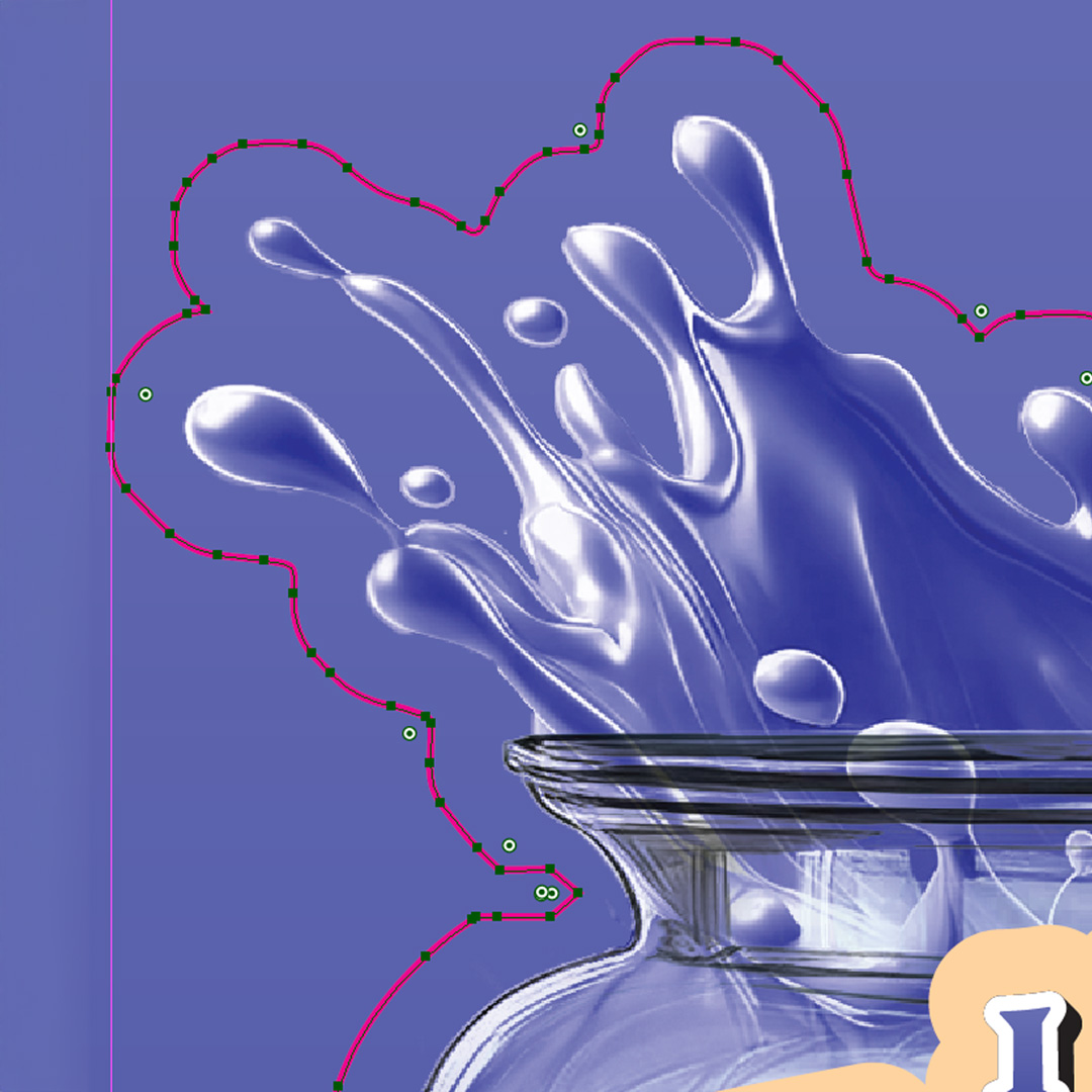
Each SKU was built around a stylized vitrolero silhouette — exaggerated, semi-transparent, and dripping with flavor. The pouch designs used layered depth, high-gloss effects, and custom fruit illustrations to evoke a hyperreal version of aguas frescas branding. Flavors were given their own identities while still clearly living in the same universe, thanks to a shared structure and branding system.
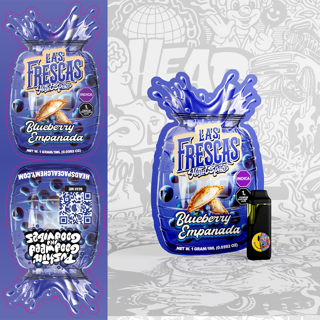
We fully rebuilt the packaging system from scratch — from concept to press-ready files. Each pouch was rendered in 3D for internal approval and promotional use. We managed file setup for both domestic and overseas printers, testing materials, ziploc placement, opacity vs. full white ink layers, and heat-seal alignment. The result was a vivid, high-saturation mylar pouch line with fully dialed-in flavor labeling and production accuracy.
The key technical challenge was balancing visual complexity with print feasibility. Since the shapes weren’t standard rectangles and had high detail, we had to push print partners to accommodate unique dielines and handle non-standard cutlines. There was also tight coordination needed to ensure the vaporizer hardware would seat properly in the pouch without compromising the look or seal.
The new Las Frescas launch was a hit. Sales doubled within the first month. Budtenders reported that customers gravitated toward the new packaging instantly — some even thinking it was an entirely new product line. The redesign solidified Las Frescas as one of Headspace’s most visually iconic SKUs, opening the door for future flavor drops and line extensions under the same visual identity.